You are hereHow to make a civil war era banner
How to make a civil war era banner
I was called about making a civil war era banner, here's how I made it. What's interesting is that I'm just making it the way we did when I first started in the sign trade, about 30 years ago. I'm not sure how they did it back 148 years ago, but this looks pretty good. First I called the fabric store, a foam rubber and fabric place on Central Avenue in Knoxville Tn; I bought 1 yard of what they called "duck cloth". Back when we would use what we called sail cloth, often we just ordered it from a place that made sails for boats.
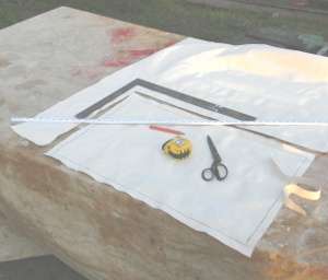 cut cloth
Here I drew pencil lines with a square and tape measure. The customer wanted "about 18 inches by 24 inches". Looking at the text, I added 6 inches to the length. So I cut it at 32 inches long by 20 inches tall; this will allow for a seam around the edge. We have an old treadle type sewing machine; I tried to use it for the sewing, but the foot was missing, so we used a newer machine. A little loss of authenticity, but still having fun.
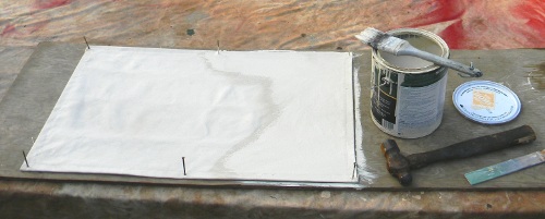
Next I took some latex (emulsion) paint that is by God's provision the exact color of the cloth, which is the color I wanted. This was left over from someone's house painting project. It's exterior paint, but I don't think it matters on a banner. The reason for coating the background is to make the banner more durable, keep it from finger stains, and keep the lettering from bleeding around the edges. You can see where I nailed it to a piece of plywood. This keeps it from getting wavy as it dries. Be careful not to nail too close to the edge. Put the nails where the grommets will go. It will have a shrunk-curved look between the nails, but that's better than wavy, and adds to the primitive look. I used the simple little grommet kit that has two steel tools, a wood block, and the grommet halves. This tool works quite well, just slower than the bench mounted jobby.
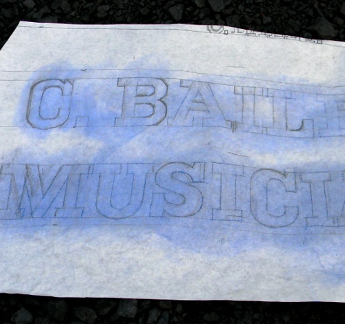
Here's a picture of the paper pattern I made. I used a pattern instead of drawing directly onto the banner because this would prevent the guidelines and "adjustments" from showing. It's about impossible to erase pencil lines from this type of banner. I perforated along the pencil lines with a tool made for the job. It's a handle with small forks at the end, and a spiked wheel. I've heard of people using a small nail attached to a handle to do the same. After I position it on the banner, I use an old sock with blue chalkline powder in it to go over the paper. This transfers the lettering lines to the banner in the form of little dots next to each other. You can see that the curved letters here have curves, which was authentic, but just didn't have the right look. So I added the angular corners you see on the final piece.
You really need to have this pattern made by a professional sign shop, because like most things in life, there's more to it than meets the eye. But I know how it is in these financially challenging times; and I know that some of you guys are going to try it all on your own. With that in mind, I'll point out a -few- of the details of typography. This isn't comprehensive, I'm just trying to get you to look closely at the subject, and see the hidden details. Remember too that our lettering goes back more than 2000 years, if you try to invent your own letter style, it's going to look badly home made, and you'll be the last to realize it. Find some old timey looking font, but one that's simple. This isn't P.T. Barnum regiment.
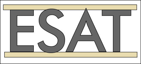 Type tips
This isn't exactly a old time font, but you might be surprised how old many everyday fonts are, and how similar the old and the new often look. Anyway, on with the tips: Look at the middle horizontal bar in the E. Notice how it's slightly above center? You probably wouldn't have noticed unless a sign guy pointed it out; that's how subtle these rules are. They are rules, practiced by any sign writer in any country where these letters are used. There's two reasons for this, one is that if it was centered, an optical illusion occurs, and it looks as thought it's drooping low. The other reason, and most important is to give the letter a solid base. By having the lower space bigger, you achieve this look.
The same holds true for the S. Notice how the lower loop is bigger, -slightly- than the top loop. Also notice how the top of the S crosses over the guide line, and the bottom of the S goes over the bottom guideline. This is how all curved letters are; they're slightly taller than letters which are straight on top and-or bottom. So a B has curves, but doesn't cross the lines because it's straight on top and bottom. The letter J crosses at the bottom, but not top. You get the idea, the reason for this is another optical illusion; if the curved letter was the same height, it would only touch at two small places, and would look short.
Another thing, take a really close look at your font, usually, even if the vertical and horizontal strokes look the same thickness, they're not. The horizontal ones are thinner. Now, about letter spacing: look how I arranged the A and T. See how the A actually tucks under the T? Think about how much space there would be if I did it differently. The idea in letter spacing is best summed up in imagining that you're pouring a jar of marbles between each letter, you need to fit the same number of marbles between each pair. Your ruler is of limited use here.
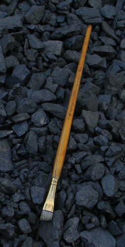
Here's the brush I used. It's flat, fairly stiff, and angled at the tip, like a deer's foot. I used gloss black oil based paint, but I think latex (emulsion) paint would work. Take your time with corners so that they're crisp. Don't go over curves so many times that your curved letters appear to be expecting.
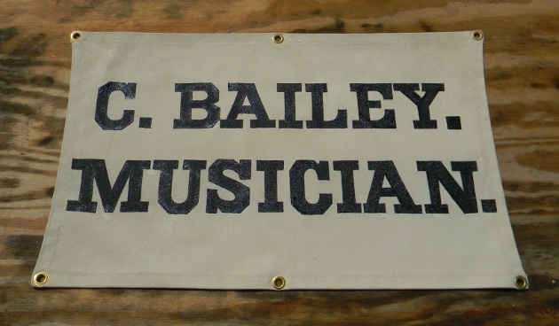
C. Bailey Musician. How to make old time banner, old west banner, frontier banner.
I was driving around doing some errands, shortly after making the banner shown above, when I spotted a man on horseback on a major highway here in Knoxville Tn. He also had a pack horse; he's riding across the U.S. on horseback to make people aware of a rare disorder that claimed his mother's life. The banner he had on the pack horse wasn't very legible, so I made him this one from the left over materials.
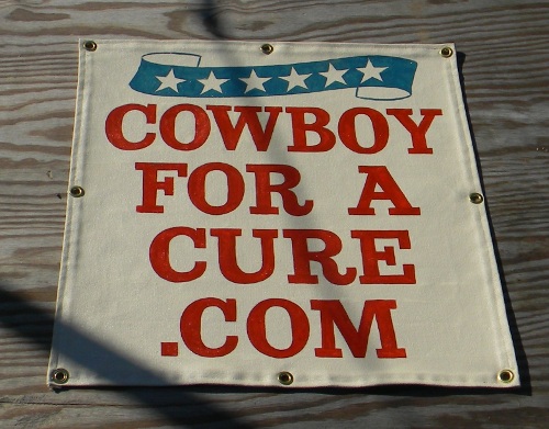
Johnny is the cowboy of cowboyforacure.com


