You are here1971 Chevrolet Rat Rod
1971 Chevrolet Rat Rod
I was contacted by Troy about putting Rat Rod lettering on his 1971 Chevrolet truck. One thing that's unique about this project is that it's a family affair; named after his son, a cute little guy who's nowhere old enough to drive yet. But the truck looked to be in pretty good shape, so maybe it'll be around when that time comes. We initially talked about a logo look for the name J. Porter Auto Parts. I made pencil sketches, but he's from out of town, so I wanted to have them ready when he arrived. We're surrounded by lots of things to do, including the tourist areas of Pigeon Forge and Gatlinburg, but I needed to get this done in one day, so that he wouldn't have to rent a hotel room, adding to his expenses. Here's the sketches I made. I try to do things the same way they would have been done back when hand lettering was the norm, and pencil sketches were the way we did it.
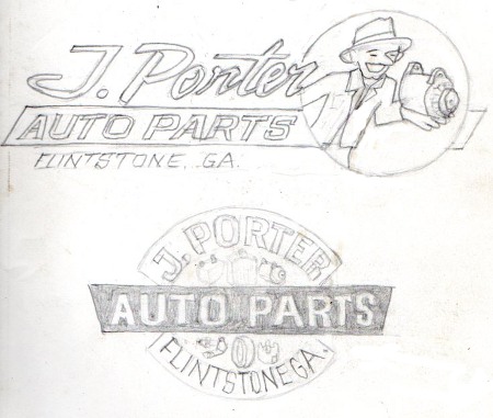 First pencil sketches
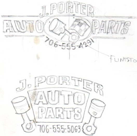 2 more sketches
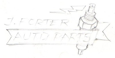 Last sketch
A design was chosen, and I set about making a paper pounce pattern. The sketches were pretty rough in terms of precise proportions, and straight lines, so I decided to scale it up with an architect's scale ruler, rather that use a projector. It was important to get the white oval on as quick as possible, so that it would be dry when I went to paint the piston and flag on it.
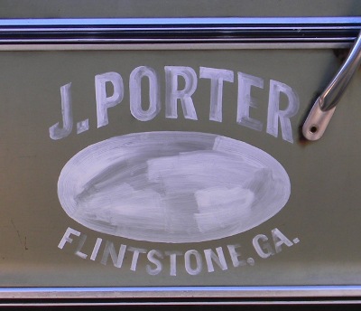
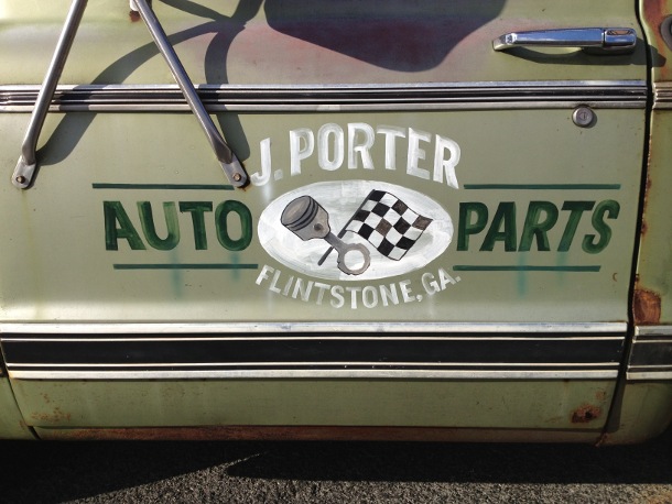
Next came the dark green letters,and a much lighter green for the stripes above and below the words. The plan was to use a monochromatic color scheme, also known as a “safe” color scheme. Monochromatic means that you use colors that are all a variant of one color, I also include neutral elements like white, black, and grays. With the time constraint, I didn't want to be redoing a color combination that didn't look as good in real life as it did in my contemplations. Alas, I had to re-do a little part anyway; these stripes didn't work as a lighter green. The design needs these lines to be very visible, to maintain the overall shape. Not a major setback, all in a day's work. Like an engine that runs well, sometimes a graphic design needs a little tune up.
The temperature wasn't really cold, but cool enough that I was concerned about the drying time of the oval. I needn't have been concerned, it was dry right on time, and I put the piston and flag on without delay. While I was changing the color of the stripes, my big fat finger dragged through a few of the green letters, so that needed cleaning up with a q-tip. By this time it was dark, and Troy was on his way, and the last thing to do was airbrush the “old” paint streaks running down from the letters.
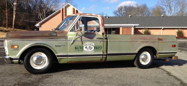
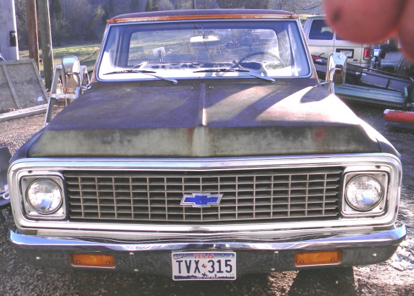
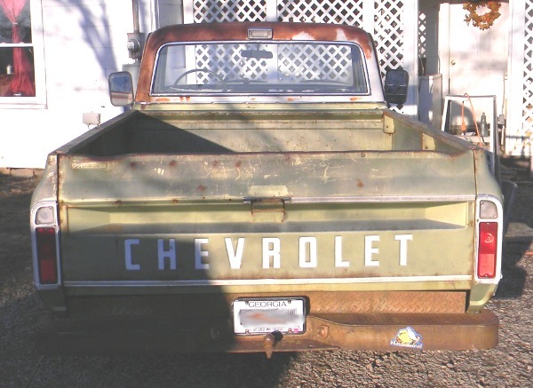
Troy was pleased with the job, and so was I. I've included a few extra pictures of the truck. There are people searching for these images, and I like having all the angles so that if I make a vector file of the truck, I've got big pictures from my chosen angles, pictures that are my own. You can use them too, it's my way of giving a little back to the cyberspace.
